Co-Benefits Climate Sprint
Duration: August 2021 (four Weeks)
Tools Used:
Figma
Miro
Basecamp
Google Drive: Slides & Docs
Client: Climate Sprints
Team of 12
Role: Design & facilitation
Key Activities
Facilitate team meetings
Delegate key action items
Synthesize insights into action
User Research Planning
Team Ideation
Build Product Mockups
Overview
Original Problem pack
How can we best value long-term co-benefits and ecosystem services when mobilizing climate finance?
In this problem pack, my team explored how we might identify, rate and price co-benefits within these carbon projects so that net-zero companies, project investors and other stakeholders appropriately assess and value co-benefits while achieving their climate and financial goals as well as ESG and impact related objectives.
If you want more detail on the problem pack, you can read it on the Climate Sprints website, linked below.
The Problem
Carbon project co-benefits are not being adequately valued during the investment process.
For example, biodiversity protection because of a forest restoration project doesn’t factor in to the value of that project’s carbon offsets. Conversely, a project that removes CO2 at the expense of biodiversity and habitat, by say, leveling native grassland to plant a eucalyptus grove doesn’t reflect that loss in their carbon pricing. We believe this is a market failing, and the goal of our team was to identify the greatest opportunity to address it.
Our solution
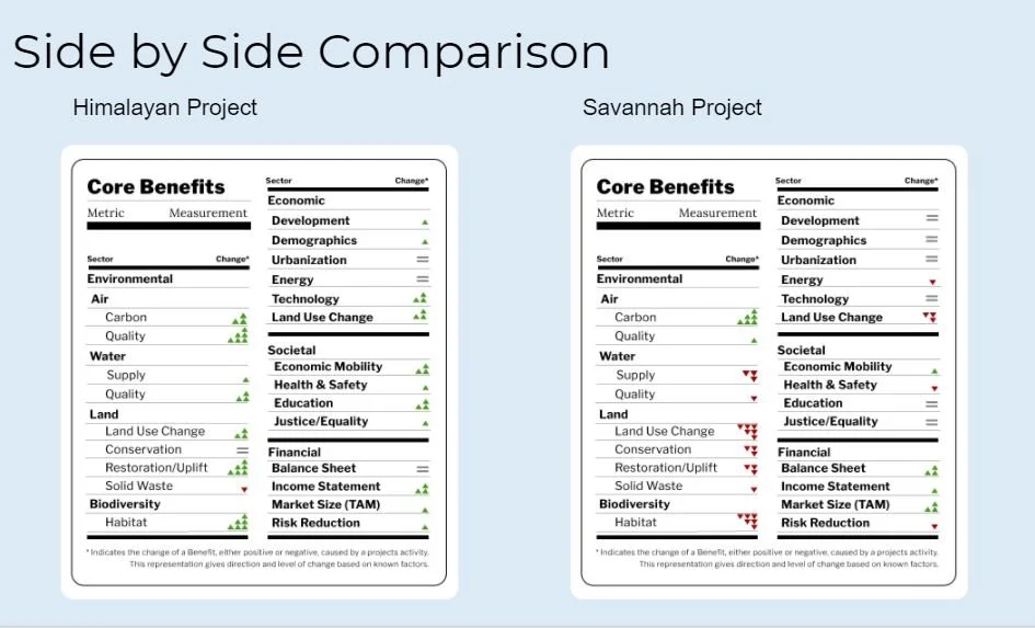
The Core Benefits Label
After interviewing investors and project developers alike, we learned that the greatest issue faced by both was the concept of ‘gaps”
Gaps in scope between investor and developer
Value gaps
Knowledge gaps
All impacting the confidence and certainty with which developers and investors can communicate about value.
When looking at how to address these gaps, the idea of a scorecard came up. Tools like the walkability score help people act on complex data without having to become subject matter experts.
However.
The interconnected and widely varied types of data steered the discussion in the direction of “A Nutrition Label for the planet.” We leaned on this metaphor as we mapped our communication tool using two example project, resulting in the first version of the Core Benefits Label.
The Label allowed us to communicate:
Four main domains: Environmental, Social, Economic & Financial
Nested Subcategories
It attempts to mitigate the tendency to push carbon removal above all else, placing it instead as one of several “Core Benefits” a project could have.
The Sprint
The Process
Structured Exploration in an Overwhelming Field
The initial sign-up for this problem pack consisted of 30 individuals across the globe. We met three times a week for one hour to discuss the problem. The discussions were organic and unstructured.
And it was highly unproductive. We often ran over time by half an hour at least, and with little to show for it.
In the first week we made nearly no progress in terms of identifying scope or direction. The leader of the problem pack came in with so much backlogged information and ideas, as well as a tendency to try to incorporate every single opinion into what we were doing. On top of that, some members were jumping in for one meeting after missing several, and derailing what progress may have been made.
At the end of second week, he was going to be away for the Friday meeting, and asked someone to facilitate the meeting. I stepped up, and set to work synthesizing what had been discussed thus far. Having worked in theatre for a decade, I understood the importance of a framework for creative exploration.
Facilitating BreakThrough
I put the most clear points into a Miro Board, and led the team in a white boarding session to identify our strongest instincts and next steps.
I began with an exercise in sharing nature stories from the past week with each other. this simple action served two-purposes:
To build a little more team identity
To bring our love of nature into this process of trying to account for nature.
After this I launched into my synthesis. The first step was to clarify our goal: To mobilize private capital for high quality climate projects.

Current Valuation Process
I then walked through what we understood to be the current valuation process and the pitfalls therein. At this stage, we hadn’t done research, but had been discussing different team members’ experience and expertise regarding the current valuation process. I built the structure of the slide and left it empty. This was our weakness, and would directly inform our action items at the end of the meeting.

the Research
Gaps, Gaps Everywhere.

After Interviewing nearly 20 individuals representing Venture Funds, Sustainable Businesses, Ecosystem Projects and beyond, we found that the key issues all centered around one theme: Gaps.
Gaps in Scope
Gaps in Expertise
Gaps in Value Perception
And these gaps were obstructing investment and development of projects with great potential, or high value. With our short timespan, this was enough proof of need for us to move forward with the concept.
Breakout
Teams of Three
At this stage, the experts were off in their respective directions, and I stepped into a curation role. Project Management Lite, you might say.
Me and another team member set out preparing for the next stage of need: identifying an entity for which we would build a label. We also started profiling investors, built the framework for the presentation, and began the white paper.
The science team began to dominate team discussions, as they needed to work through the incredibly complicated structure needed to quickly and accurately identify value in a given area.
Secondary Research
Familiarizing ourselves with the Landscape
The team undertook competitive analysis of three personal Stylists, determining:
The Personal of Personal Styling- Each Stylist built up a personality that reinforces their expertise and care for their clients.
Focus on the User and how personal styling benefits them.
Brand Alignment
At this point, I asked Garik to send us the brand guidelines for Eco-Stylist, as well as the work from the previous UX team he employed during the redesign. While I enjoy the visual aspects of design, with our short timespan, I thought it a better use of our time to build off elements that had already been made, rather than reinvent the wheel.
Expert Interview
Eco-Stylist had recently hired a Personal Stylist, Hillary, who boasted years of experience in fashion. The team jumped at the opportunity to hear Hillary’s experience of styling clients after they had gone through the existing personal styling flow on the site.
Key Insights from Hillary included:
Clients were very concerned about receiving support after purchasing recommended clothing.
The main factor connecting her clients was they were short on time, or need help starting their Eco-Style journey.
User Interviews

One Eco-Stylist client and four new Users.
We had Users move through the existing Eco-Stylist Site, expressing their confidence in selecting a styling service.
Users mentioned liking the sustainability text, but did not cite it as meaningful for choosing a service.
Users had significant issues getting more details about the Styling Process. They clicked a Styling Service, and were thrown off by the expanding select a stylist option. They clicked the browser’s back button, and were sent back to the main styling page. After several cycles of this, Users determined that they were uncomfortable moving forward.
Insights
Directing our Focus
After five interviews, we built our affinity map, parsing out patterns in response and attitudes during the interviews and tests.

This affinity map led us to several key insights.
Users could not decipher the information regarding the services or process, and were missing info on Stylists.
Lack of original media undermined User trust in the results and missed the opportunity to build excitement.
The navigation did not follow Users’ natural inclination to seek out more info for each specific service.
The current focus on sustainability activism on the page did not sway Users’ choices.
Non-ux Concerns
Several testers pointed out that they didn’t like that personal styling would be an additional cost on top of purchasing more expensive clothes in service of sustainability.
They cited that they were seeking styling help because they believed they needed new and different clothes. Budget was a significant factor in their decision to pursue personal styling. We viewed this concern as having several different contributors that better UX could help to clarify and mitigate. We would be remiss if we didn’t acknowledge that the problem with conversion might not result solely from poor UX. It could be a poor market fit, or mismatched service to needs.
Since we’re not in the practice of enacting dark patterns to make people buy things they don’t want or can’t afford, our hypothesis included: Better UX can clarify whether your Users really ARE willing to pay for this service.
User Journey
What’s Their Current Experience?

We laid out the journey that Users took when they visited the styling pages, and presented it to Garik. The major UX problem we identified was that Users got tripped up on the navigation.
When they clicked “Start Here” they were expecting more service information, but are brought to the scheduling page. However, the scheduling page has some opaque descriptors for each service, so they click the service expecting it to lead them to details. Instead, the selection expands to show available times for selection.
The User tries to go back, but there’s no in-site back button, so they use the browser back button, and end up on the styling main page again.
Rinse and repeat and they give up.
This messy navigation is obscuring any other useful hypothesis we could make about Users’ affinities for personal styling at all. We endeavor to solve it.
“How Might We help Eco-Stylist Users rediscover their personal style within their sustainable values?”
Ideation
Creating Simple Solutions
From our interviews, we learned that Users were:
Already interested in enacting sustainable fashion choices by the time they reached the Personal Styling Pages.
Short on Time to do the research and purchasing themselves.
Want to be assured that they will look and feel great at the end.
With how the site stands, we hypothesized that increasing conversions was a matter of focusing the content to answer the second two points: saving Users time and making them look like the most amazing version of theirselves.
Rather than a total overhaul, we wanted to clean up and expand the ability of Users to learn more about:
The Service Levels
The Stylist
The Results
The available brands.

This new flow breaks apart the information gathering and the selection and purchase process, in order to more closely align withe commerce standard flow.
Sketching
Visualizing Progress
While the information architecture for this section of the site isn’t over-complicated, we wanted to quickly sketch our ideas to make sure we were on the same page before jumping into wire-framing.
The scheduling page was populated by a third-party app with it’s own design and interactions built in, so once the Users got there, we needed them to be ready to purchase.


Wireframes
Hierarchy before Beauty.
After sketching, each team member took one section to wireframe. I wireframed the Styling Main page, building a more direct progression of relevant information and calls to action. My goal was to present enough information for Users to move forward to their next step - selecting a service, learning more about the stylists, or the scheduling page.


We presented these wireframes to Garik, and moved forward with a high-fidelity mockup for testing. His main concern was Users getting frustrated at having to click through too many screens, which we addressed with CTA on each screen allowing Users control over how much they need to read through before moving on to scheduling.
Prototype & Test
Because of Eco-Stylist’s minimalist design, transitioning from wireframe to high-fidelity was fairly simple. Each of us took the wireframe we build and turned it into a high-fidelity mockup.


We put together a testing script, and sourced five more subjects, taking them through the new pages. The three of us conducted these interviews, recorded them, and put together another affinity map.
Our major finding regarding User aversions led to a deeper insight about trust, and served to direct the recommendations that we gave to Garik.
Personal Style is Vulnerable. Users want confirmation that they’ll be taken care of from initial contact to final fit.
Once the progression had been cleared up, Users were looking for signs that they could trust Eco-Stylist to provide them clothing recommendations that not only worked theoretically, but on their unique body.
The quote that came up in some way:
“I’m an odd shape”
With this in mind, we realized that Eco-Stylist must:
Highlight the Personal Experience in Personal Styling.
Frame services and Stylist experience from the Users’ Need to know that their unique body and style will be taken care of.
Provide greater evidence of Eco-Stylist’s results.
Iterate
Incorporating Test Results to Improve the Product
With the little time we had left, we wanted to incorporate the testing results that we received. While the layout remained almost identical, we took to editing the copy to better reflect User goals.

Implementation
UX Revelations
With good insights and the confidence that our process revealed and solved some key UX problems, our team ended our time with Garik and Eco-Stylist. He implemented our design recommendations and launched the new pages within a month.
It Doesn’t always work out
On reaching out to Garik in mid-February 2022, I learned that he had determined that Personal Styling wasn’t a worthwhile business endeavor for Eco-Stylist. Ultimately, the services weren’t converting, even with better UX with greater alignment to User Goals & Needs. Users transitioning to a sustainable wardrobe would just rather spend their budget on the clothes, not the styling professional.
What I Learned
It can be discouraging to learn that your solutions didn’t actually solve the problem. But it’s a great reminder that a key function of UX is to ensure that you’re solving actual problems. It’s not a silver bullet for misaligned business activity or poor market fit. UX is meant to work in tandem with the other segments of a business to enable good ideas to become great products.
Question More
As my first interaction working with a business for UX, I was focused on performing UX methodologies with integrity. Garik expressed his concern that Personal Styling might ultimately be a lost cause. In my next endeavors, I expect that leaning into that concern, and performing a better gauge for User Affinities before launching the design process could ultimately save time answering the wrong questions.
While I do believe that the work we did was useful for Garik to learn more about the mindset of his clients and Users; it clarified for me that I have to dig deeper into stakeholder concerns from their use case and context.
Divide labor better
This team was working together for the first time, each of us looking to practice as many of the skills we learned at UNH as possible. This meant that each one of us interviewed, built architecture, ideated, wireframed, and designed. We did a good job referring back to the process, and building our deliverables together. The benefit of having multiple eyes on the test script meant that it evolved much more quickly.
It also meant that the interviews we conducted weren’t consistent. Each of us focused on asking different questions from the script, and that directed the flow of the test.
Check Bias often
One of our team members was coming from a career in graphic design, and it showed in the types of questions she asked, the recommendations she made, and the design choices she made.
While her experience meant her visual execution was competent, she made choices for the visual appeal before the practicality of the flow, or the ease of the experience. She focused on whether Users liked the design of the site, less than whether they could figure out how to get where they wanted to go.
Deciders and Facilitators
Our team opted for a very egalitarian approach to decision-making, opting for discussion and consensus.
We were good at:
Posing questions to be answered through testing, rather than debating at length.
Supporting and refining each others’ work.
Catching what others missed.
We failed to:
Reign in personal biases.
Regulate our approach with Users to ensure consistency.
Present fully unified and focused recommendations to Garik.
This could have been more appropriately done by selecting a decider for the team, or a lead for each stage. My graphic design teammate may have had good visual insights, but she opted to complicate the steps in the process in order to showcase her visual chops. By the time this happened, we built a team rapport of giving feedback on each-others’ screens, but leaving it to the team member to take or leave it.
What I Did Well
Getting to Pain Points
My interviews revealed key interaction pain points with Users. I love observing Users experience and work through issues, and am able to sit with them through the discomfort and allow them to figure it out. I’m good at reserving answers and aid for after a session. I was able to pick up on behavioral cues to dig deeper into an experience.
Build Rapport
I can be quite analytical and blunt, so building rapport with teammates, stakeholders and Users is a skill I’ve worked hard to develop. I enjoyed getting to know Garik throughout the process, and building communication with my teammates in such a short time.
Giving Feedback & Support
My third team member and I worked fairly similarly in terms of presenting elements for the team and incorporating and cleaning them up to build consistency across screens. While I wasn’t ultimately felt that our graphic design member took liberties, I know that I picked my battles and provided better context than if she had worked alone.
Getting Users Excited
My design focus was the main styling page, and I spent TIME on the header, hero and tag lines. Users connected with a photo of a real person and the punchy headline. With the insights from the script, the copy I edited became even more clear and User-centric. I’m so proud of that segment, and the evolution it took in such a short time.
Getting excited myself
I love having ideas. But I love even more when those ideas are accurate and effective. The more I learn about a product or problem area, the more excited I get about it. I want to contribute to the space and improve the offerings, and I think that shows in the way I conduct research, testing and ideation.
It’s natural to develop your own idea of what will work, but I become even more energized when I figure out an option that will be even MORE useful than my initial thought.
Once we learned that Users feel vulnerable during this process, lights flicked on for me. Had we had a longer time with Eco-Stylist, I would be chomping at the bit to continue to dig into the services and products that would best support them.