
Savr Design Sprint
Duration: One week
Tools Used:
Figma
Google Drive
Client: University of New hampshire
Team of 1
Role: UX Design & UI design
Key Activities
Identify key pain points & insights.
Ideate to address user needs
Build Wireframes & High Fidelity Screens for Prototype.
Overview
goal
Increase satisfaction for users following recipes
Following the Google Ventures five day design sprint, I was tasked with solving a user issue for a recipe app called Savr.
Savr is a new startup that shows hundreds of recipes, and cooking tips for at-home chefs. They have an active community of users who rate and review recipes for other users.
Recently, Savr has seen some negative reviews about recipes that involve many steps, or more advanced techniques.
The Problem
Users following Savr recipes are frustrated with the instructions and disappointed in the outcome.
Savr gets lots of positive feedback on the quality of their recipes but now they need to help users accurately, and easily follow the cooking instructions. These dissatisfied users don’t feel the instructions are clear, or easy to execute. Their most cited issues are:
Timing
Order of steps
Learning new techniques

Savr Case Study
The Process
Follow the Venture Sprint Road
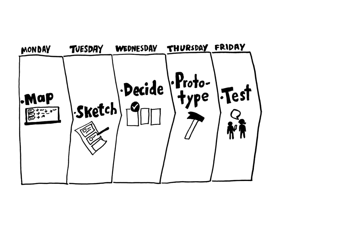
The Google Ventures sprint framework, developed by Jake Knapp, to quickly ideate and test solutions to a given problem.
Five Days. five steps.
The framework is straightforward. You have five days, each devoted to one step in the process. At the end of each day, no matter what you’ve accomplished, you move on to the next step. This framework helps to bypass the perfectionist tendencies that can stall a project.
Day One: Understand (Map)
Focus on understanding the issue, not brainstorming fixes.
Day Two: Sketch
Find a solution to address the target you found at the end of day One.
Day Three: Storyboard (Decide)
Create a detailed step-by-step plan that guides the prototype.
Day Four: Prototype
Build a fake model of the final solution.
Day Five: Test
Conduct a series of interviews with users as they try your prototype.
At the end of the week, you’ve either tested a solution, or you know to move on.
Day One: Understand
The Beef with Home Chefs


The Savr research team interviewed eight users, and distilled each interview down into a few key phrases. These phrases, as presented to me, revealed the following insights.
Users enjoy trying new recipes, as they believe it is the best way to learn to cook.
This means that Users seek equal parts challenge and guidance.
They want to feel accomplished after trying a new recipe, not defeated.
They want to come away from each new recipe feeling more competent in the kitchen.
Users feel as though the recipe format doesn’t help them prepare in advance with tools or prep (cutting, mixing) that they can do.
Users are regularly surprised by a technique or step that they do not understand.
Users hate having to refer back to their phone or look up a term while in the middle of a recipe.
Time is a precious resource for Users.
They want recipe times to be true to reality (inclusive of prep time/research time)
They want time-saving instructions that will help them multitask
They want to not waste their time making a recipe that fails them halfway through.
“Sometimes I feel like steps are sprung on me...and that turns an enjoyable experience into a stressful one.”

User Persona: Nick from LA
29 Years Old
Behavior
Nick cooks around three nights a week for himself and his girlfriend.
He enjoys trying a new recipe, and thinks it helps him learn basic cooking techniques.
He likes tweaking a recipe after cooking it ‘by the book’ once.
Frustrations
Sometimes he’s not sure if he’s ‘on the right track’ halfway through preparing a meal.
He’s not always clear on ‘what’s next’ and how he can prep a few steps ahead, leading to mistakes and wasted time.
If a dish doesn’t come out as expected, he doesn’t really know what went wrong, nor what he should learn for next time.
Referring back to his phone each time a new technique or step is introduced is very stressful.
Goals
Follow a recipe easily and confidently, so his dish comes out as expected.
Nick wants trying new recipes to be enjoyable and challenging, not stressful and chaotic.
End of Day One:
What I Understand
Users of Savr want to grow as home chefs through the recipes they follow. They enjoy a challenge, but struggle with a lack of support and needing to refer back to their phones with messy hands.
They want to know what they’re getting into before they start, so that they can plan how to succeed.
Day Two: Sketch
Solutions that Suit
"...search for existing ideas you can use in the afternoon to inform your solution. It's like playing with Lego bricks: first gather useful components, then convert them into something original and new."
I.E. a good competitive analysis.
Before going into my own ideation, I took a look at recipe apps currently on the market to get a sense of what’s working now. Surprisingly, I found that most recipe apps don’t yet address the problems cited by Savr users. The most developed app I looked into was Tasty by Buzzfeed.

Great:
Has text directions AND video instructions, which would address user concerns of not knowing what each step should look like.
Good:
App lets you switch between the text instructions and video.
Option to add items to grocery list reminds users to check if they have everything they need.
Fine:
No "up next" prep.
Ingredients list doesn't include tools needed.
Still need to touch your phone a lot.
Sketching
Gamification at work
In order to quickly ideate on my own, I played a game called Crazy 8s. The concept is simple: divide two papers into four quadrants, and quickly sketch different concepts into each quadrant. If one of them isn’t great, you have seven more. Go for quantity over quality.


From reviewing existing cooking apps, I knew that video tutorials were important to include in the instructions. But in attempting to sketch out solutions for users being surprised by next steps or techniques, I hit against the limitations of the phone screen size. There’s only so much information you can give at one time considering the context of use.
In Crazy 8s, I sketched two screens that had the potential to address this concern:
A prep screen, giving users the option to review key tools, ingredients and techniques before starting the recipe.
A ‘hands free mode’ feature, that allows users to use voice command to move through the recipe once it’s started.
I also got excited at the prospect of a ‘master recipe’ feature. Users complained about poor timing, and I envisioned an app that could combine and reorder the steps from multiple recipes into one, perfectly ordered and timed, master recipe.
Sidebar: context mismatch
While working on this sprint for a phone app, I speculated that the solution would be better represented by a tablet app. My reasoning for this was the users’ stated issue of needing to see where they currently were and where they were going next at the same time, without touching their device. This is difficult to accomplish on a phone screen, which touts enough screen space for one piece of critical info to accomplish a step. I felt that my solutions would feel more intuitive with a slightly larger screen size.
At this point, my mentor advised against deviating from the prompt, so I continued with my solution.
Narrow the options
The Critical Screen

Preparation is key
At this point, I needed to decide my ‘critical screen’, the screen that represented my solution.
I determined that the critical screen to address the most user issues was the prep screen. By giving users the option to view new techniques, gather tools, and go into the recipe more prepared, I expected it would alleviate multiple issues:
Saving time during cooking by knowing what tools they need in advance.
Feeling as though they learned something, even if it doesn’t go perfectly.
End of day Two:
What I Decided
“I’m up for a challenge...I think it’s the best way to learn to cook.”
Savr users don’t just want to make food; they want to become good, even great, cooks. A Savr user is going to seek out recipes that challenge them, and they want an app that helps them meet that challenge.
A cooking class on your iPhone.
With that in mind, building a solution that gives users the critical preparation stage of successful chefs and kitchens was my best step forward in making Savr that cooking class.
Day three: Storyboard
Driving the Narrative
At this point, even though I determined my critical screen, I wasn’t fully willing to let go of the ‘hands free’ feature or the ‘master recipe’ feature.
It’s obvious in retrospect that I should have kept my focus narrow, but I wanted to solve as many of the issues as I could. So I moved forward with incorporating three solutions into the design, and it slowed me down immensely.
Regardless. I moved forward setting up my user scenario and journey.

Within the app, I built a storyboard that took Nick from recipe selection to completion.

At this point, I began sketches. I love using procreate to do this, because it allows me to sketch on the tablet like it’s paper.
The ease of erasing or duplicating an image does encourage me to make things more complicated than it needs to be.
My goal in the prep screens was to give as many different users the access they need to whatever it is they’re most unclear about.

End of Day Three:
What I Developed
By the end of Day Three, I had a series of sketches that would take a user through the entire process of selecting and making multiple dishes. I developed a through line for users to interact with each of my three “critical screens”. I made educated assumptions about at which points a user may want to learn more about a given technique.
Day Four: Prototype
Building a Realistic Façade
Day four is meant for rapid prototyping of the solution sketch. Here’s where things went off the rails, for a few reasons:
I was struggling to find users to test this prototype who I hadn’t already used for previous projects.
Rapid prototyping isn’t really rapid when you’re building an overly complicated solution.
Even though this was a sprint, I wasn’t given any design guidelines for the app, so I had to do a style guide, real fast. This was an entirely extra step to get to a realistic-enough prototype.
Style Guide
I pulled the orange from the images that I found about Savr. Since my previous project was a lighter design palette, I chose to build the Savr app in a dark theme.

Color palette with Savr orange as the accent
icon pack using Savr orange accent color.

For this prototype, I wanted to try out the frosted glass trend that was cropping up at the time. I worked to include affordances to help users know that they can do things like swipe right and left on the prep screen.
The main addition I’ve made that I hadn’t seen in other recipe apps was the ‘New Techniques’ section. This is a feature that operates on user history, tracking techniques used throughout recipes and helping users by warning them about any new techniques they may want to preview before jumping in, as well as the ‘Familiar Techniques’ section, which gives users the opportunity to brush up on something they may have done before.

I built the hands free mode as a modal pop up before users moved on to prepping the recipe. While in the recipe phase, I followed the Tasty app design of incorporating a video alongside written instructions so that users have access to both types of information throughout the recipe, hopefully addressing their issues about feeling lost and unclear about when things are going wrong.
In each step, the status bar tells users which recipe they’re working on, and what step they’re on in the process.

The completion stage included options to photograph, rate and review the recipes. This is in direct response to users interviews stating that reviews are extremely helpful when they choose a recipe.
Of course, users are given the option to skip any of these screens.
End of Day Four
What I Refined
At this point, because of the short nature of the sprint, I did my best to build a 1:1 prototype from my sketches without deviating too much. Most of my work was spent on the style guide and fitting the information into each screen.
I labored over the necessary usability heuristics and focused on system status, affordances, and recognition over recall.
Day Five: Test
No budget, no problem.
I was really hung up on not re-using test subjects, and this hurt me. Because of this, in the short timespan, I was only able to acquire three Users to Interview. Two men in their 30s, and an avid female baker in her 30s.
Interviewing Users is a relatively easy process for me. The mantra of “Tell me more about that.” opens up a great deal of opportunity for Users to reveal insights without being led.
Findings
Each of them gravitated to a different page of the preparation screen.
There were a couple UI standards that I overlooked, and it showed. Feedback was the primary issue in the preparation screen.
All of them struggled with understanding what hands free mode meant.
While one User loved the combination of recipes. One User hated it. This validates the need for User control regarding how they interact with the recipes.
Micro Copy is important. ‘Hands Free’ Vs ‘Text Only’ was confusing.
Recommendations/Next Steps
Add Header Nav in Preparation
Give Users setup tutorial
Include Measurement options (volume vs weight & Units)
Allow Users to select whether they make each recipe on its own or as a whole.
Redesign for Tablet.
What I Learned
There are aspects of the design sprint that suit my curiosity and creativity well. The very same sprint structure is challenging for my high-performance drive.
don’t overachieve
I was given guidelines and expectations, and then I set a higher bar for myself. This slowed me down and caused me to miss my deadlines and fail to come up with the required five people to test.
Less is more
Similarly, by refusing to choose one critical screen, I made my own job harder, overcomplicated the sketch and prototype, and potentially muddied my test results. In these instances, pick one key feature and build that. Next week you can test a different one.
Steal
Even though I was frustrated at needing to build a style guide, I still built one. Rather than steal as much as I could from the few clues given by the app images in the research deck, or pulling from existing, free style guides and component libraries. I could have saved myself time.
What I Did Well
Addressing problems directly
Users stated that they got frustrated by being surprised by a new technique, so I did my best to directly address that issue. Even with the overcomplication, I managed to keep that solution in focus.
Understanding user mentality
I think I understood a key aspect of Savr’s users, which is that they want to grow as cooks and challenge themselves. That understanding helped me get in the mind of someone who wants an app that introduces them to new skills each time they interact with it.
I finished it
This sprint ultimately was very discouraging. The moment I started falling behind, I was faced with having to sacrifice my expectations of what I can deliver. I was angry with myself. I was working on the project alone. I wanted to give up.
My mentor helped me accept that testing with three users was better than not testing at all. I did it. I finished. I’m not particularly proud of the quality, or my work process. My documentation was terrible. But I finished it.